
Starbase, Texas

Gateway to Mars

The official municipal website for the newest city in the Rio Grande Valley, a launch site unlike any place on Earth. I designed and built a dark, cinematic government site that carries civic information with the gravity of a space program.

A government site that doesn't feel like one

Most municipal sites bury residents in gray tables and broken PDFs. Starbase had a harder brief: serve real civic functions — commission meetings, ordinances, permits, public notices, beach and road closures — while reflecting that this is the operational home of humanity's push to Mars.

The answer was a near-monochrome system. Pure black canvas, off-white type, and the city's own launch photography and sunrise video doing all the emotional work.

Every recurring civic need became a reusable, CMS-driven module so city staff can publish notices, meetings, and closures without touching layout.

Design goals

  • Make required civic information fast to find and act on
  • Let photography and video carry the brand; keep UI restrained
  • Build CMS-driven modules staff can update without a designer
  • Stay legible and accessible on a pure-black, high-contrast base
  • Read as a credible government source, not a marketing splash page

Full scroll, top to footer. Scroll inside the frame to move through the page.

Structure before surface

Wireframes mapped the information hierarchy and the reusable modules before any styling.

Homepage

A vertical stack that opens cinematic and resolves into scannable civic modules.

  1. Notification marquee: API-driven and real-time, scrolling civic alerts (beach closures, road delays) sit above everything.Sticky nav with mega-menus.
  2. Sticky nav with mega-menus: Government, EDC, and Permits expand into grouped link panels so deep civic pages stay one hover away
  3. Full-bleed video hero: Sunrise launch footage provide the emotional moment on the page
  4. Explore carousel: CMS-driven community cards keep the page feeling alive between official updates
  5. Meetings + Notices, side by side: The two most-requested civic resources share the fold below, each with a View All escape hatch
  6. Live status strip: Beach and road access render detailed open/closed states pulled from the API
Homepage

Navigation & Mega-menu

A government site lives or dies on wayfinding. Top-level categories open into grouped panels rather than long dropdowns.
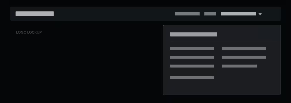
  1. Grouped link panels: Each category (e.g. Government) reveals its children in a two-column panel. No scrolling, no guessing
  2. Persistent navigation: Making navigation was key to ensure residents can always find their way. Navbar hides on down-scroll and appears on up-scroll
Navigation & Mega-menu

Public Notices & CMS List

The workhorse template. A repeating CMS collection of titled records, each with a downloadable document, paginated with View All.

  1. One record, one row: Title and date left, a consistent Download button right. Staff add records and the layout never breaks
  2. Graceful empty states: Collections like Commission Meetings render a plain "No meetings to display" instead of a blank void
Public Notices & CMS List

Mobile

The same stack, collapsed to one column. Hero shrinks, mega-menus fold into an accordion drawer, modules become full-width.

  1. Drawer navigation: The hamburger opens a full-height accordion mirroring the mega-menu groups.
  2. Priority order preserved: Alerts → hero → explore → civic modules → status. Nothing reorders; it just stacks.

Mobile

Color

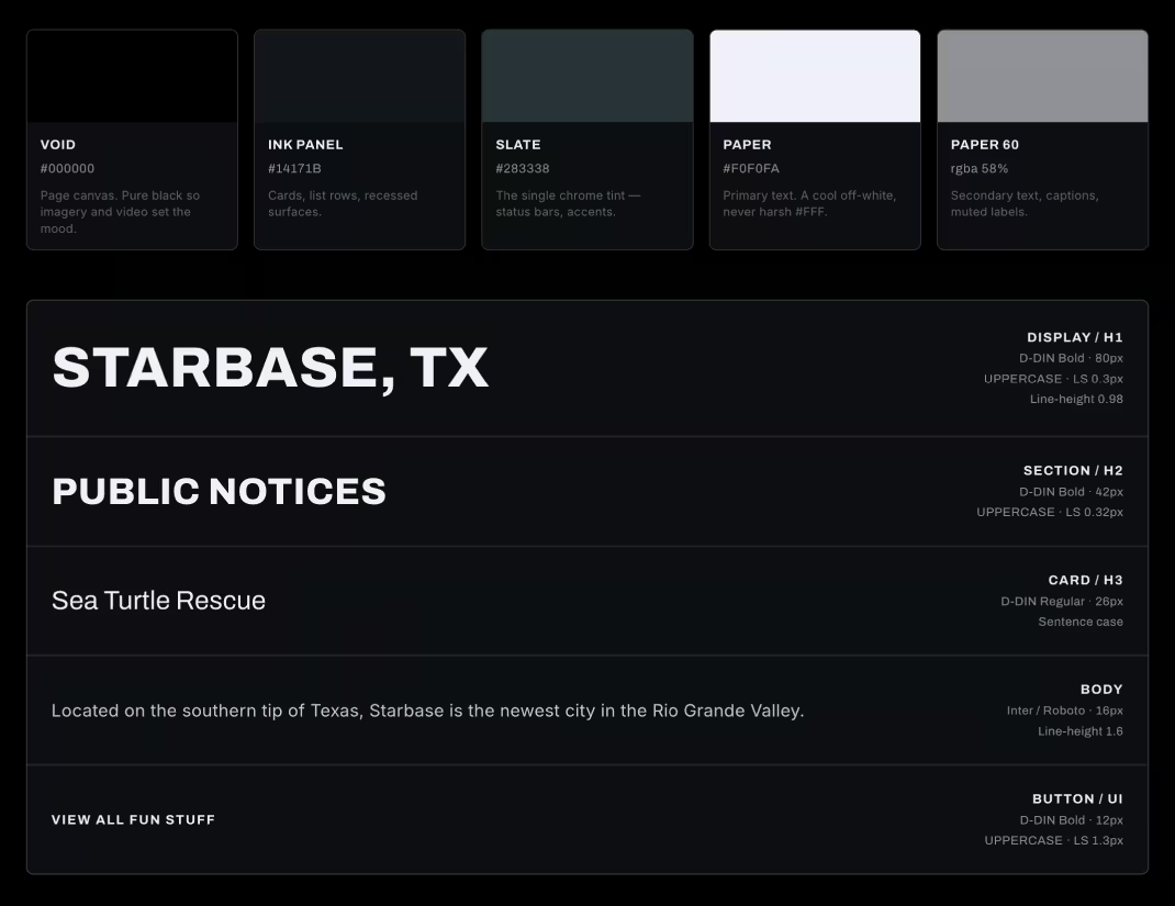
Near-monochrome, photography-led

A deliberately narrow kit: one near-black palette, one engineering typeface, and a small set of modules that staff recombine. Restraint is the brand.

There is no marketing accent color by design. Photography supplies every warm tone on the site.
Color

Components

Buttons

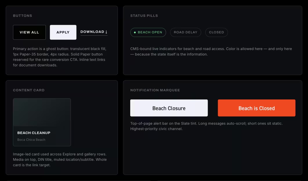
Primary action is a ghost button: translucent black fill, 1px Paper-35 border, 4px radius. Solid Paper button reserved for the rare conversion CTA. Inline text links for document downloads.

Status Pills

CMS-bound live indicators for beach and road access. Color is allowed here — and only here — because the state itself is the information.

Content card

Image-led card used across Explore and gallery rows. Media on top, DIN title, muted location/subtitle. Whole card is the link target.

Notification marquee

Top-of-page alert bar on the Slate tint. Long messages auto-scroll; short ones sit static. Highest-priority civic channel.
Components