
Identity work across security, AI governance, and construction. Simple, legible, and made to hold up small.
BlueLake tests the things attackers actually go after. Systems and people, from one platform, with findings a customer can put in front of an auditor.
That promise only holds if everything produced behaves the same way. A report, aslide, a landing page and a conference banner should all read as though thesame company made them, because the same company did.
Automated pentest and security provider.
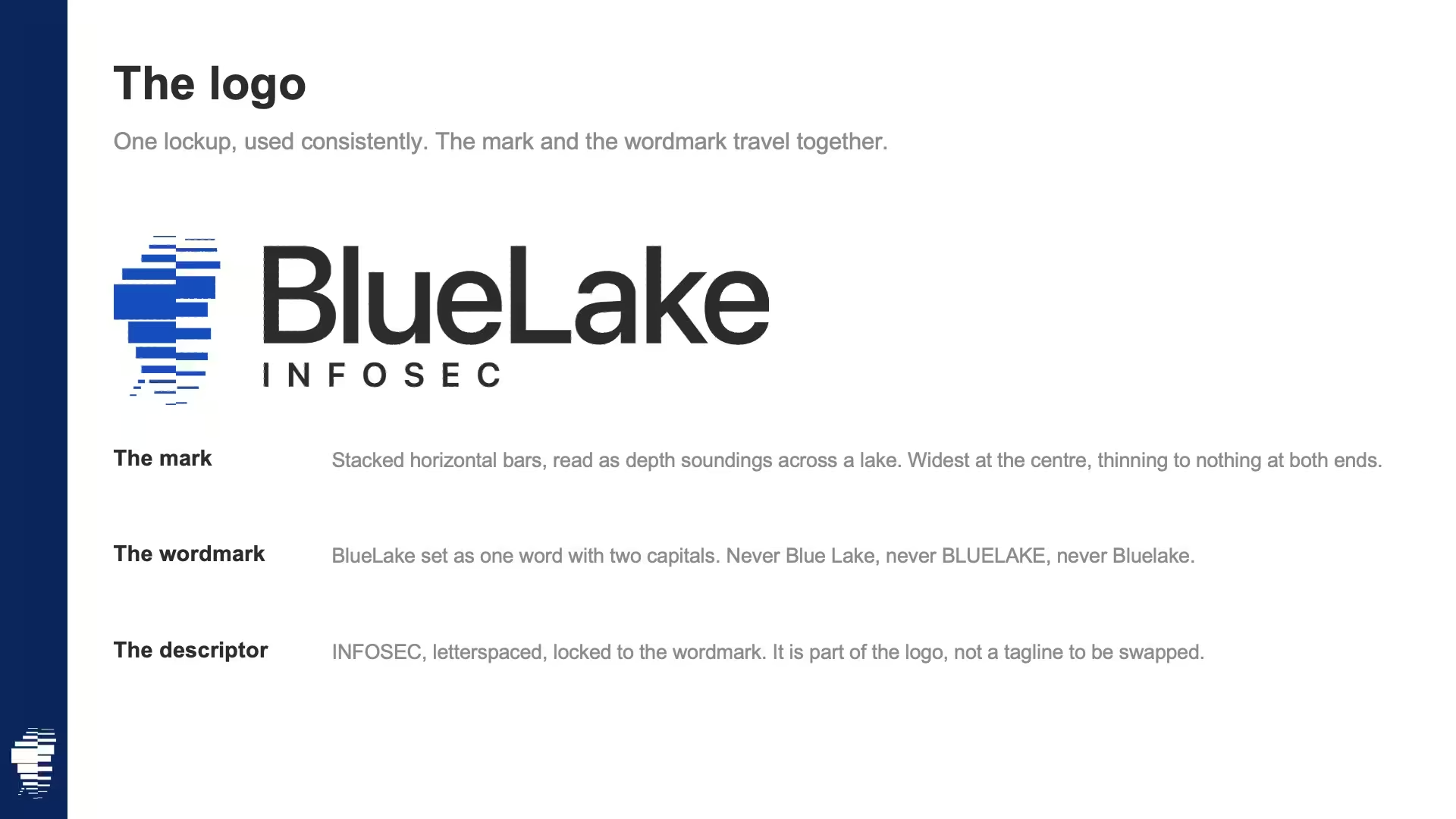
The mark: Stacked horizontal bars, read as depth soundings across a lake. Widest at the centre, thinning to nothing at both ends.
The wordmark: BlueLake set as one word with two capitals. Never Blue Lake, never BLUELAKE, never Bluelake.
The descriptor: INFOSEC, letterspaced, locked to the wordmark. It is part of the logo, not a tagline to be swapped.

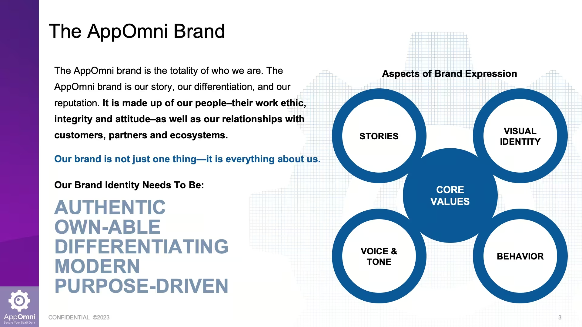
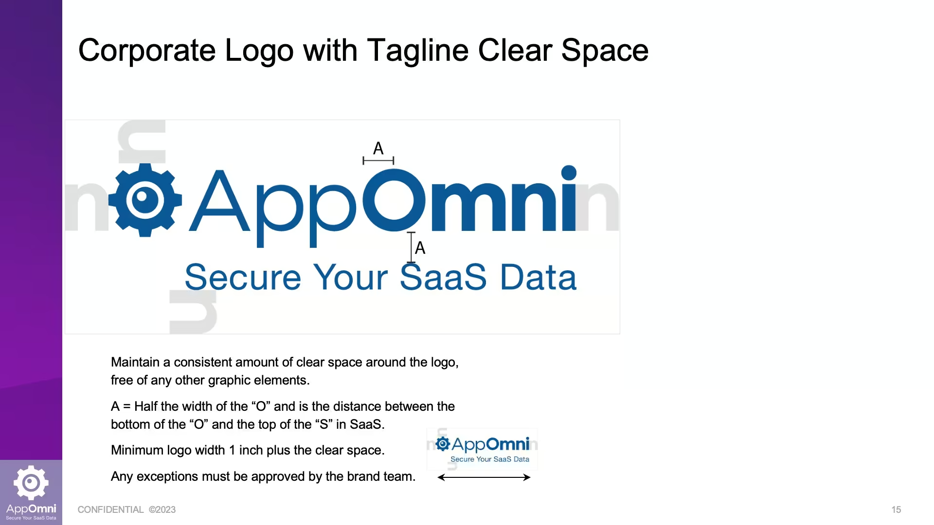
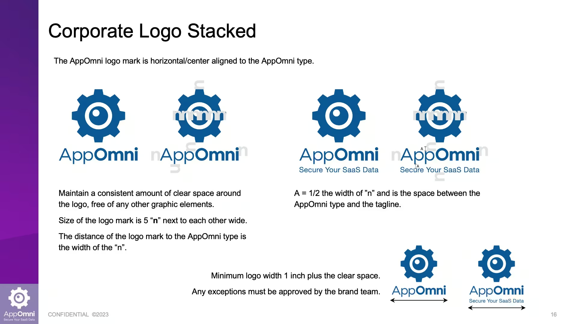
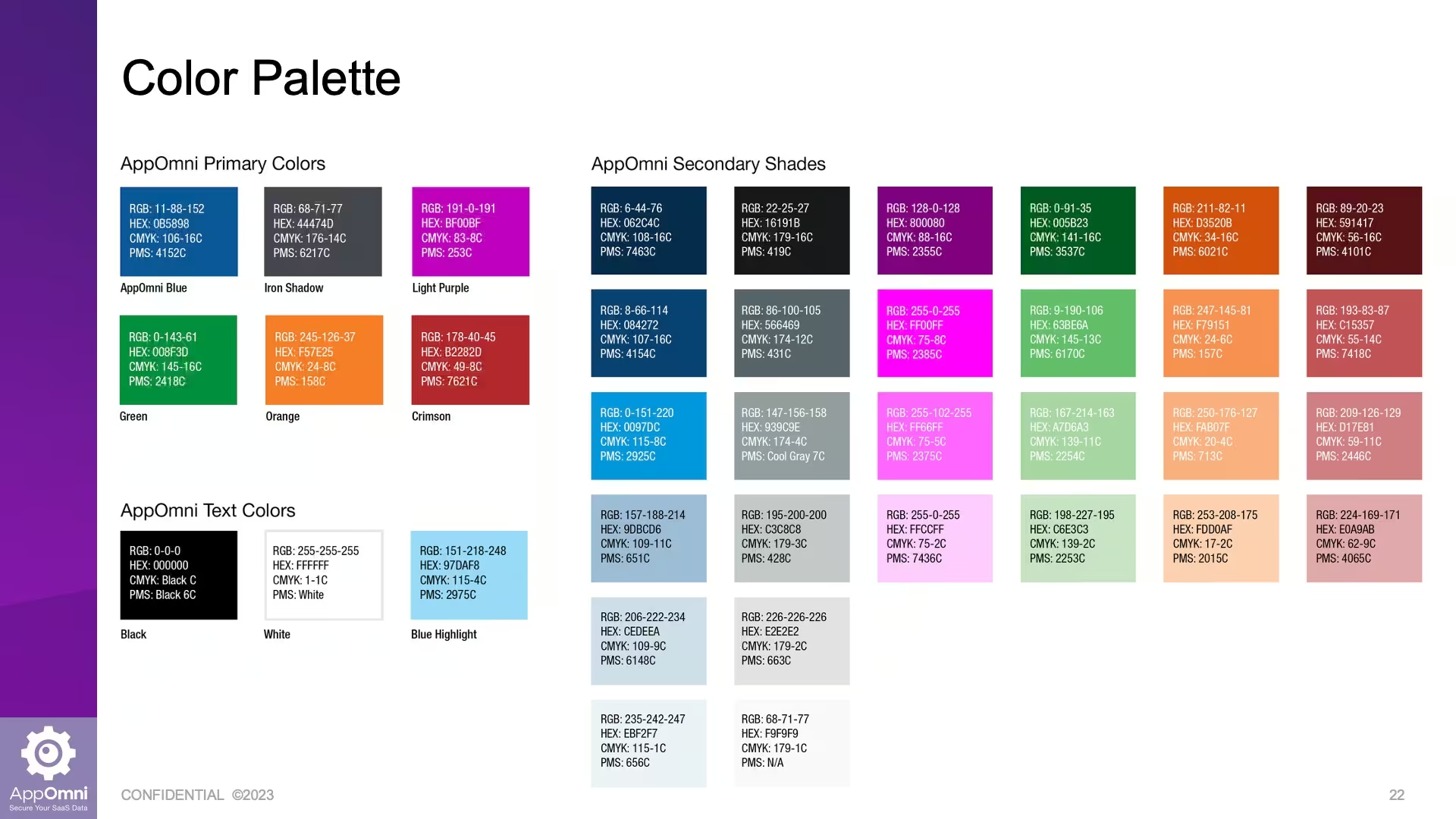
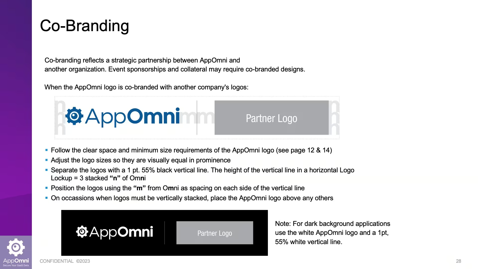
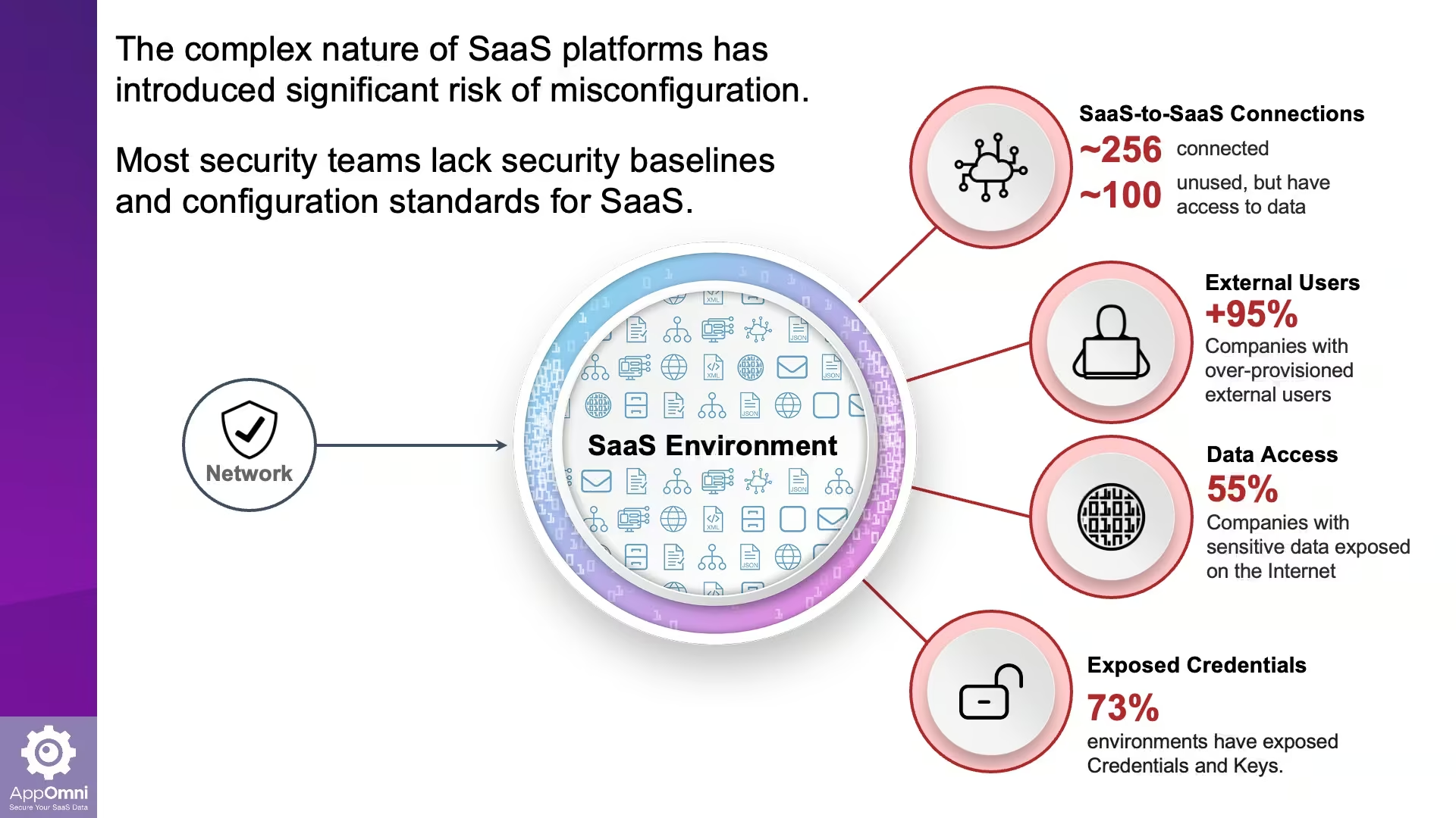
AppOmni had a mission and no shared way to express it. I built the brand guide that fixed that: core values and brand personality up front, then the working standards behind every asset, including voice and tone, typography, color, graphic elements, and co-branding rules. The result is a reference that lets anyone at the company or external vendors produce materials that look and sound like AppOmni, without guessing.
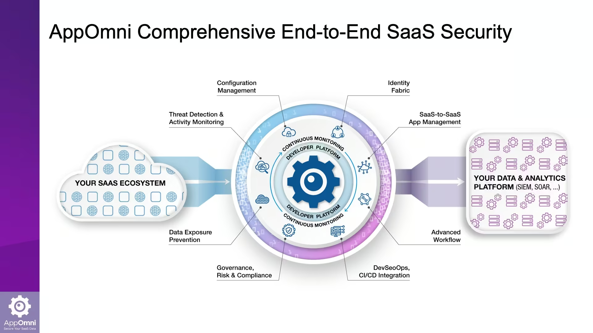
The gear is the one icon everybody already reads as "settings." I made it the focal point of the new identity so the brand carried the product's core promise, managing and securing every app, before anyone read a word of copy.
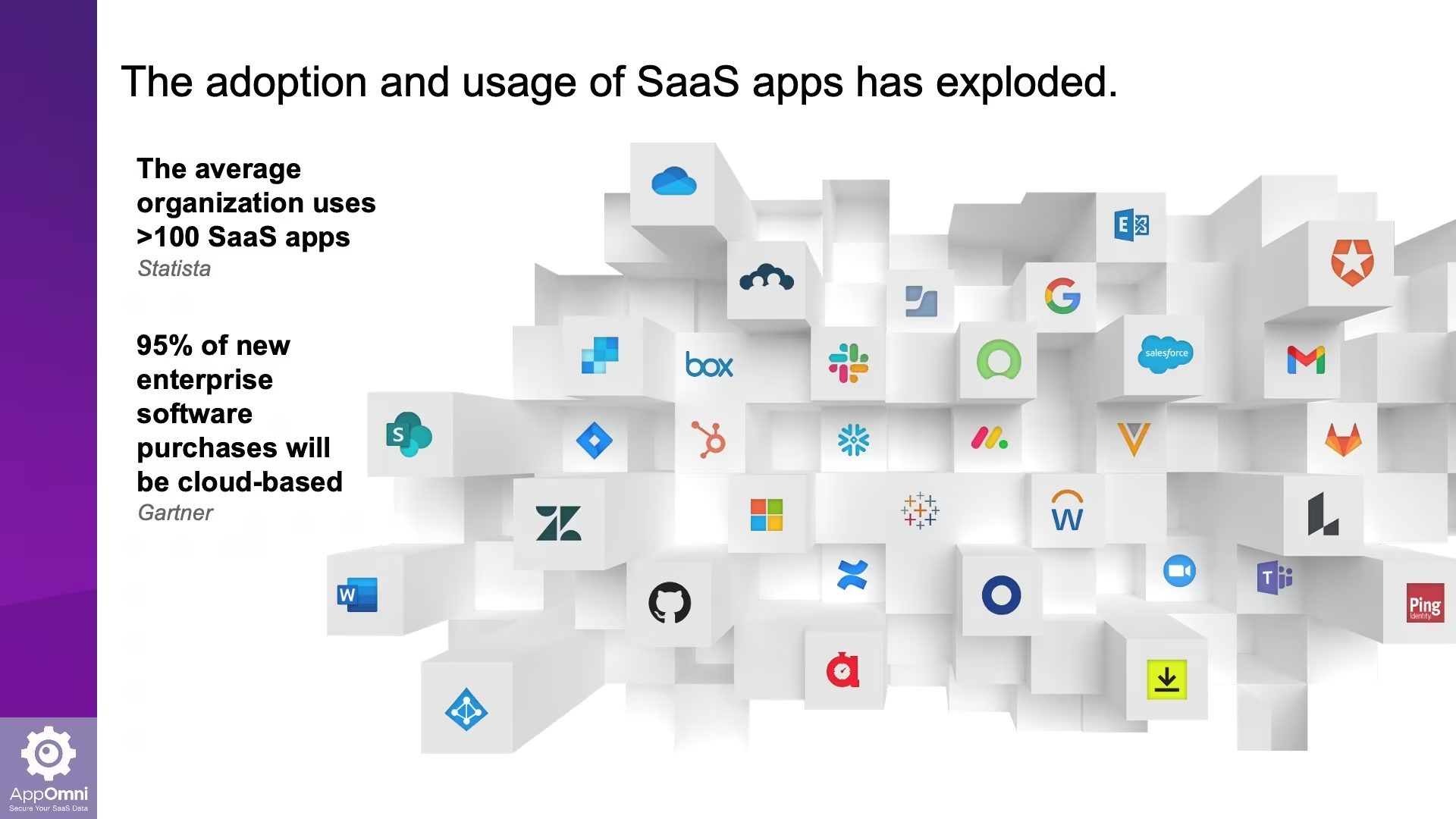
From there I built out the system: custom graphics for event banners, presentation slides, and digital assets, all designed to hold attention in environments where most brands blur together.




Official city logo.

AI Security and Governance.

Think tank for AI and security experts.
Cybersecurity MSP.

Construction service and consulting.
Let's talk. Fill out the form and I'll be in touch.
