
BlueLake Infosec

A professional site for Benthic, an autonomous AI penetration-testing platform. The brief: make deep, technical security work feel fast, trustworthy, and modern to a skeptical buyer. I handled design and build on Webflow.
  • Role: Design & Development
  • Scope: Wireframes → UI → Build
  • Platform: Webflow / CMS
  • Live: bluelake-infosec ↗

Selling trust in autonomous security

Security buyers are trained to distrust hype, and "AI agents that run your pentests" sets off every alarm. The site had to do two jobs at once: explain a genuinely novel product and earn credibility while doing it.

The design leans clean and editorial — a light, near-white canvas, restrained Geist type, and a single blue accent. Generous whitespace and plain-spoken copy signal confidence.

Design goals

  • Make a technical, abstract product legible in seconds
  • Earn trust through restraint, not security clichés
  • Carry one blue accent across an otherwise neutral system
  • Structure the page as problem → solution → proof → demo
  • Build modular CMS sections the team can extend.

Full scroll, top to footer. Scroll inside the frame to move through the page.

Structure before surface

Wireframes set the narrative order and the reusable section patterns before any visual design.

Homepage

A top-to-bottom argument: hook, problem, solution, proof, conversion. Each band is one idea.

  1. NSplit hero: Plain-language headline and subcopy on the left; the animated render on the right gives an abstract platform something to look at
  2. Floating capability chips: "Analyze Web Apps" and "Inspect Your Network" label the visual so it reads as product, not decoration
  3. Problem as a list: The challenge section pairs a short thesis with three outlined cards naming the pain points buyers already feel
  4. Three solution tiers: Single Agent, Multi-Agent, and Human + AI map to security maturity and budget in parallel cards
  5. Quantified proof: A four-up stat row (5x faster, zero false positives, 24/7, compliance) converts claims into numbers
  6. Dark CTA: The only inverted band on the page focuses attention on the demo request — a deliberate tonal shift at the decision point
Homepage

Navigation & Dropdowns

A standard SaaS bar with two grouped dropdowns (Products, Resources) and a single high-contrast CTA pill anchoring the right.

  1. GTwo-column flyouts: Products and Resources expand into labeled link pairs (title + short description) so the IA reads at a glance
  2. One clear CTA: "Let's Talk" is the only filled element in the bar — a single, obvious next step everywhere on the site
Navigation & Dropdowns

Recurring Section Pattern

Most of the page is one flexible block: blue eyebrow, large heading, supporting line, then a row of cards, stats, or steps.
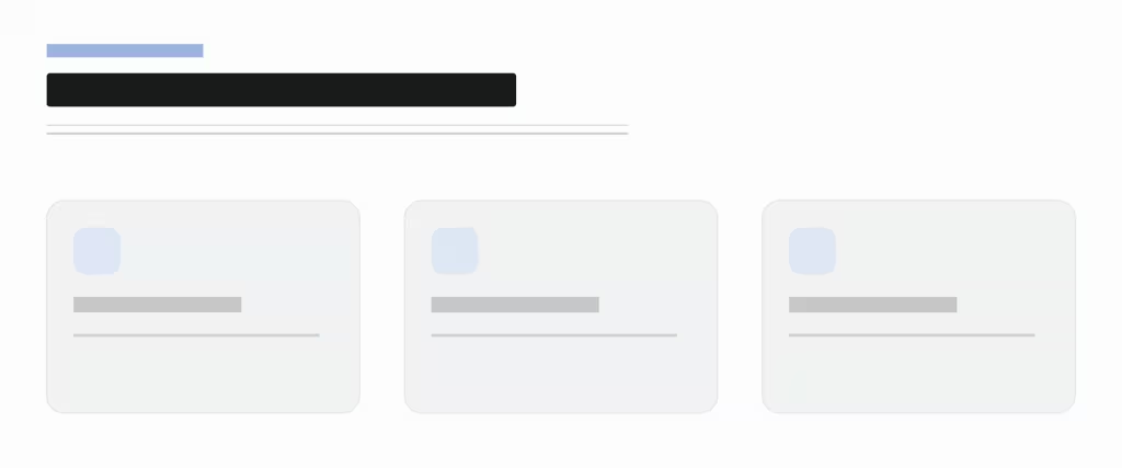
  1. OEyebrow, heading, content: The same three-line header opens every section, giving the long page a steady, predictable rhythm
  2. Swappable card row: One grid renders problem cards, solution tiers, stats, or steps — the team reuses it without new layout
Recurring Section Pattern

Mobile

One column. Hero text stacks above the render; card rows become single-file; the CTA keeps its dark emphasis.

  1. Text-first hero: The headline leads; the render drops below it so the value prop is never pushed off-screen
  2. Order preserved: Every section stacks in the same narrative sequence — nothing reflows out of argument order
Mobile

Color

A neutral, editorial kit built for credibility: a near-white canvas, one typeface, one blue, and a small set of rounded modules that compose the whole page.

Typography

Geist (keeps everything in one family at a calm Medium weight — no bold shouting. Headings set tight and sentence-cased to feel like product UI, not advertising. The uppercase blue eyebrow is the one consistent typographic signal that opens each section.

Color

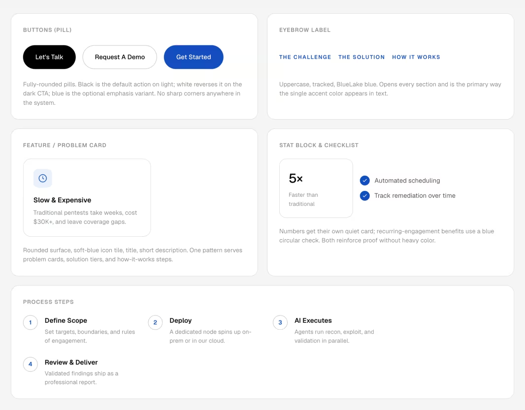
Components

Buttons

Fully-rounded pills. Black is the default action on light; white reverses it on the dark CTA; blue is the optional emphasis variant. No sharp corners anywhere in the system.

Eyebrow

Uppercase, tracked, BlueLake blue. Opens every section and is the primary way the single accent color appears in text.

Feature / problem card

Rounded surface, soft-blue icon tile, title, short description. One pattern serves problem cards, solution tiers, and how-it-works steps.

Stat block & checklist

Numbers get their own quiet card; recurring-engagement benefits use a blue circular check. Both reinforce proof without heavy color.
Components